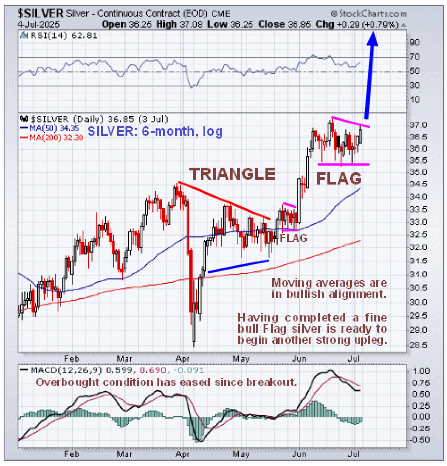
The uptrend in silver is gathering pace. On its latest 6-month chart we can see that, after breaking sharply higher it rose by several dollars early in June before settling into a consolidation pattern – a bull Flag – that has served to ease its overbought condition and allowed the 50-day moving average to partially close the gap with the price. This bull Flag is believed to be about complete and we can therefore expect to see another sharp upleg soon that is likely to be similar in magnitude to the one leading the Flag and may well be stronger given that there is now less overhanging supply to be worked through.
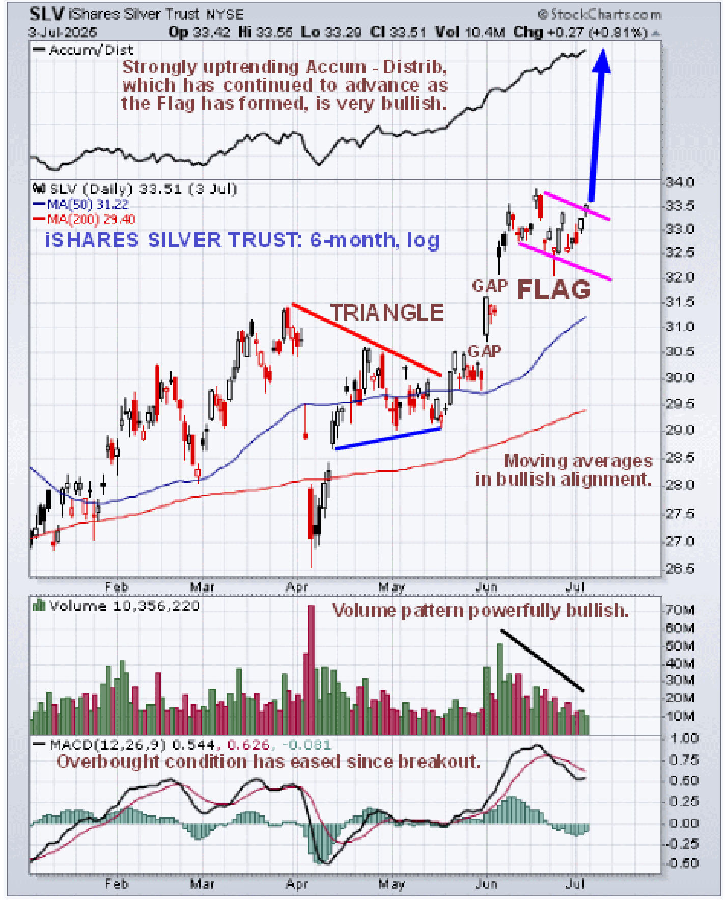
Unfortunately, Stockcharts charts no longer show volume, which is viewed as a grave omission, but we can get around this by looking at the chart for faithful silver proxy iShares Silver Trust for the same period. This is well worth doing as it reveals a powerfully bullish volume pattern, with strong volume on the sharp rally early in June that has progressively died back as the bull Flag has formed over the past several weeks, which of course parallels the one in silver itself…
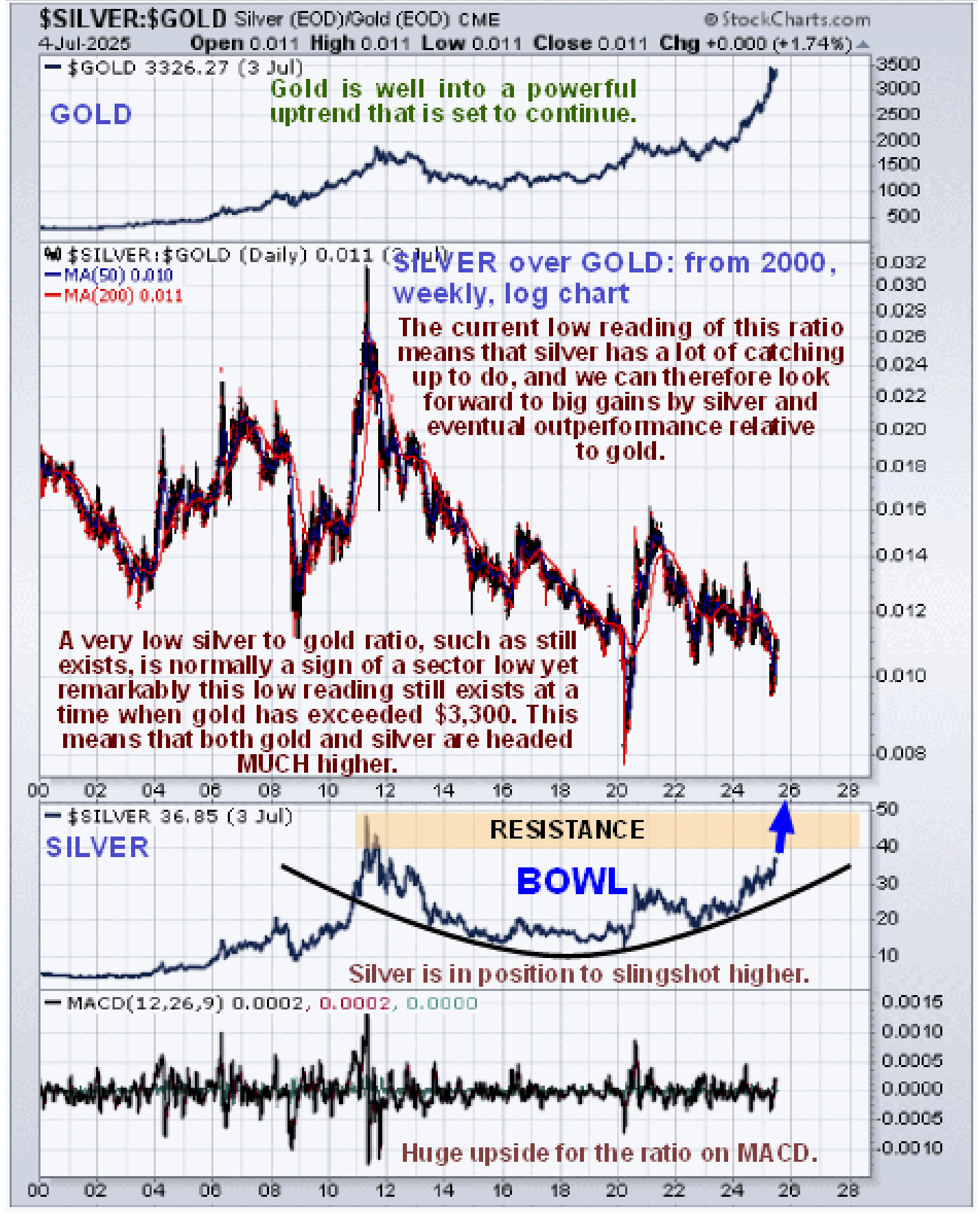
We can more readily see why silver is likely to accelerate to the upside on its 7-year chart. Leaving aside the fact that it is way undervalued relative to gold, the price is now advancing away from a giant Bowl pattern that looks set to slingshot it higher. The final resistance is at $50 which it is getting within striking distance of – once it clears that it should take off in a manner that few can presently imagine.
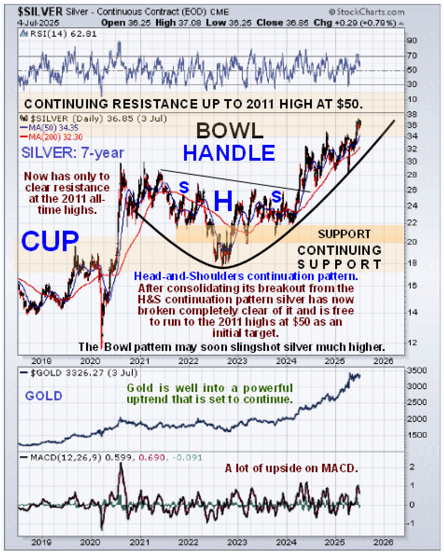
On the long-term chart going back to the start of the millenium, i.e. to the start of 2000, we can see the origins of the resistance that silver is currently working its way through, which is the top that formed in 2011 – 2012. Once it breaks clear above the high point of this, which is at $50, it will be in new high ground and free to accelerate away to the upside.
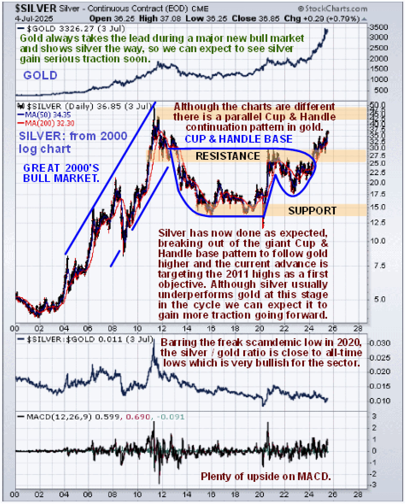
Lastly, it’s worth taking a look at the silver over gold ratio chart for the same time period, from 2000, which shows that despite gold’s big gains from early last year, this ratio is still at a very low level, which means that this sector bull market has much further to go. This sort of low reading means that there remains very little retail interest in the sector – this is very bullish for the sector and for silver in particular which is regarded as a “steal” at these prices. The rationale behind interpreting this chart is this; when there is a lot of speculative interest in the PM sector, investors favor silver over gold, because it has the capacity to make bigger percentage gains faster – this is what we saw when the sector peaked in 2011 with silver hitting $50 in the late Spring of that year and gold topping out later in the year in September which is why the silver over gold ratio hit a peak. When, on the other hand, the silver over gold ratio is at a low level it means that speculative interest in the sector is at a low ebb, investors have no interest in it, which is very bullish as it means that there is the potential for it to go much higher. This is what we saw at the ratio lows in 2003 before the sector headed much higher, at the lows of the 2008 broad market crash which dragged the PMs down with it and at the time of the Covid Crash in the Spring of 2020 when we saw a freak low due to the orchestrated mass psychosis that existed at that time.
 In conclusion, silver looks poised to begin another sharp upleg shortly and the long-term outlook for it could not be better.
End of update.