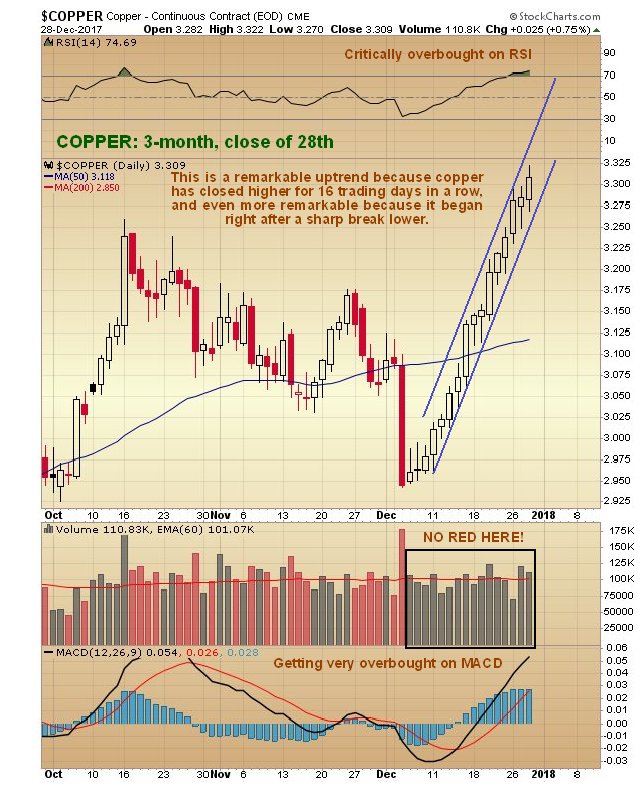
We have seen an unusually steady uptrend in copper this month, that has resulted in it appreciating by about 10%, which might not sound like much, but makes a big difference if you are a producer with fixed costs. What is remarkable about this uptrend is not only that it came hard on the heels of a high volume smackdown in the early days of the month that at the time looked bearish, but that we have seen 16 days trading days in a row of higher closes as of the close of trading on Thursday, as can be seen on the 3-month chart for copper shown below. After doing some extensive research it has been discovered that the fundamental reason for this day after day seemingly interminable uptrend was that a prominent Chinese buyer, who has an old fashioned way of doing things, was walking over to the London Metals Exchange every day for weeks with his black briefcase in hand and buying roughly the same amount of copper…
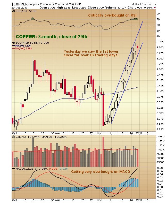
But sadly, on Friday, he was run over by a London bus whilst on his way to the exchange, and was thus unable to buy and the price dipped for the first time in a long while…
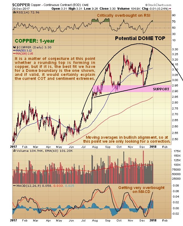
We will now zoom out to look at copper on its latest 1-year chart. On this chart we can see that, while copper still has not broken down from its steep uptrend in force all this month, it is getting very overbought on its MACD and RSI indicators and is quite a long way ahead of its 200-day moving average, and these factors, taken together with the now extreme COT structure and sentiment indicators that we will look at shortly, suggest a high chance that it will go into reverse here or very soon and react back.
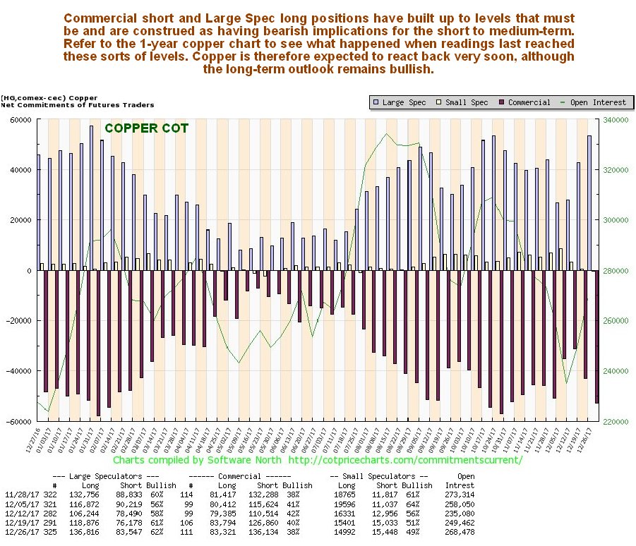
Next we will look at copper’s latest COT chart, which, since it also goes back a year, can be directly compared to the 1-year copper chart above. As we can see, Large Spec long positions are very close to their highs of the past year, and when they have reached these sorts of levels in the past, a reaction back by copper reaction has ensued, and a reaction is made more likely given the factors that we have observed on copper’s 1-year chart, and the sentiment extremes which now exist that we will look at next.
Click on chart to popup a larger clearer version.
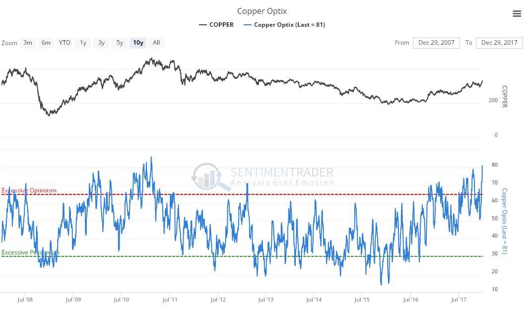
On the latest copper optix, or optimism chart, we can see that bullish sentiment towards copper is at the sort of wild extremes that we have only seen once before in the last 10 years, and that coincided with a major top. This is not to say that it does this time, but it would certainly seem to indicate a high probability that we are at or close to a significant intermediate (medium-term) top.
Click on chart to popup a larger clearer version.
Chart courtesy of sentimentrader.com
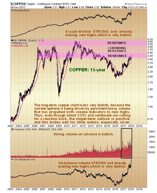
The long-term chart for copper actually looks very bullish, because the bullmarket that began in October 2016 has been driven by record strong upside volume, which has propelled both volume indicators to clear new highs. What this suggests is that, while the other factors that we have already looked at, allied with the considerable resistance approaching the old peaks that we can delineate on this chart, will probably force a reaction back soon, the longer-term outlook remains favorable, with a high probability that copper will eventually proceed to break out to new all-time highs, i.e. get above even its 2011 peak in the $4.60 area. If that happens its rate of rise can of course be expected to accelerate.
Whilst a detailed look at the copper price technicals may seem like a waste of time to some of you, given all the other subject matter for such analysis, it is important to keep in mind that we are not looking at copper for its own sake, we are looking at it because of its implications for the economy generally, and especially because of its implications for the outlook for the prices of other metals, especially silver. What we are seeing on these copper charts, principally its long-term chart, bodes very well indeed for the future trend of silver prices.
End of update.
Posted at 1.20 pm EST on 30th December 17.