In the light of what we observed on the charts for the broad stockmarket on Saturday we will now proceed to review some charts for the Precious Metals sector.
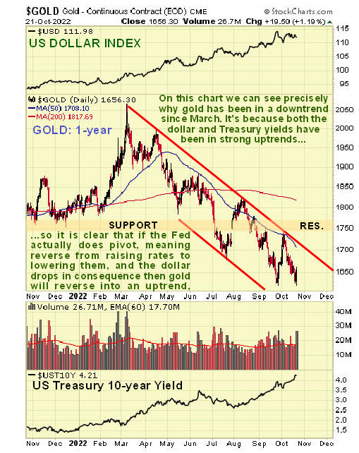
On the 1st chart, the one-year chart for gold, we can see precisely why gold has been in a quite severe downtrend from its peak last March. It is because the dollar and interest rates, shown at the top and bottom of the chart, have been in strong uptrends during this period. So if the Fed does pivot soon, that is to say it stops raising rates and starts lowering them, it will mean that a reversal to the downside in the dollar and to the upside in gold and commodities and risk-on assets generally, and as we saw on Friday, even
talk of a pivot is enough to generate a recovery.
A very important point to note is that, while gold has dropped about $400 from its March peak, in real terms this decline is much more serious because of the robust inflation during this period. So when you talk about $1600 gold now, it means that in say 2019 prices it’s probably about $1200. This gives us more of an idea about how undervalued gold and especially silver are now. Before leaving this chart, observe that gold may be making a Double Bottom here with its September lows.
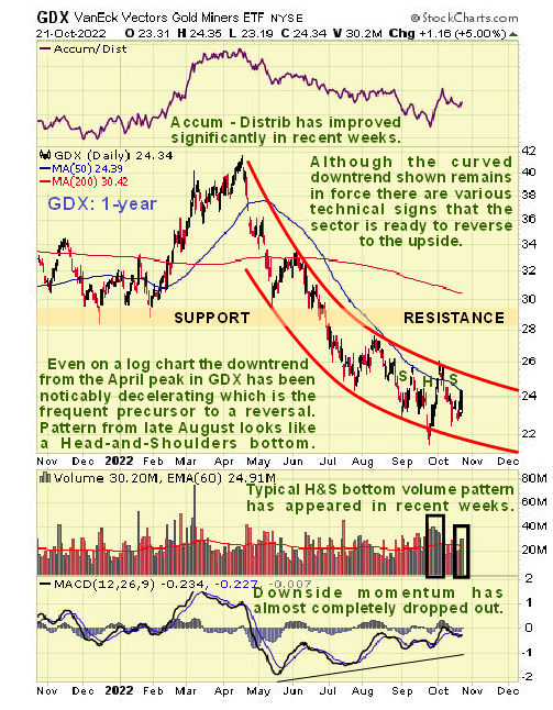
The next chart, the 1-year chart for PM sector proxy GDX, is most interesting as it makes plain that, even on a log chart as this is, the downtrend in the sector from its April highs has been decelerating steadily to the point that the MACD indicator has recovered back almost to the zero line. This is the sort of behaviour that usually precedes a reversal to the upside, so it is not surprising to see that a small Head-and-Shoulders appears to be completing within the downtrend cannel, whose validity is endorsed by the bullish volume pattern that has accompanied it, with strong volume on the rise to form the right side of the Head of the pattern and again on the rise late last week as it completes what is believed to be the Right Shoulder of the pattern.
If this interpretation is correct then we are at a point of huge opportunity to buy the sector before it breaks out.
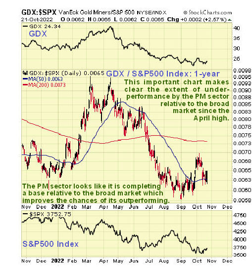
In the context of the foregoing it’s useful for us to consider the extent to which the PM sector has markedly underperformed even the frail stockmarket in recent months. On the 1-year chart for GDX over the S&P500 index we can see that it has
seriously underperformed due of course to the strong rise in the dollar and interest rates. This is important because it means that the PM sector is even better value here compared to the broad market.
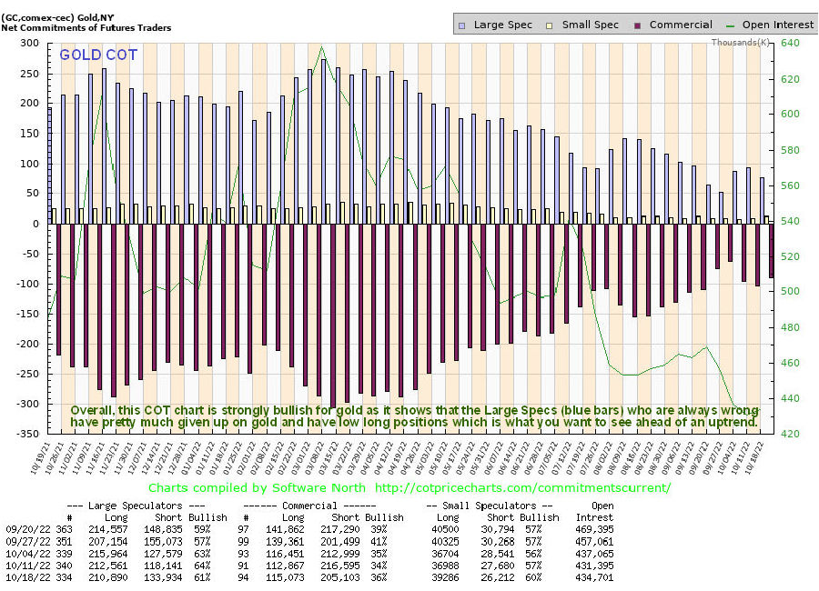
Alright, so if we are at or close to a bottom in gold and the PM sector then we would expect to see the normally wrong Large Specs having Little interest in gold, and that is exactly what we see on the latest COT chart for gold, which shows that they have pretty much given up on it. This COT chart alone augurs well for a new bullmarket phase in gold….
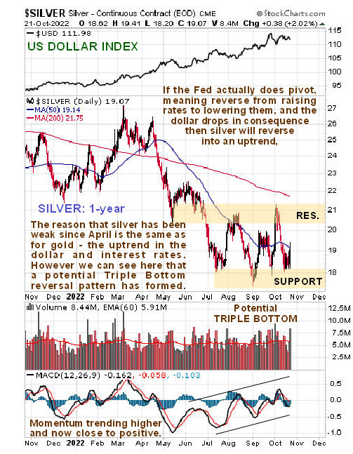
What about silver? On its 1-year chart we can see that it has dropped back from its March highs for the same reasons that gold has, the strong uptrends in the dollar and interest rates. However, since July a potential base pattern has been building out that is now starting to look like a completing Triple Bottom and the with the steadily uptrending momentum (MACD) now about to swing positive, the outlook is brightening and Friday’s rise on strong volume, better seen on a 6-month chart, looks like the beginnings of a rally up towards the resistance at the upper boundary of the pattern. Silver is regarded as probably the most undervalued asset in the world and in the dark times that we are headed towards, physical silver is probably the best asset to have in your possession, along with some firarms to make sure that it stays in your possession.
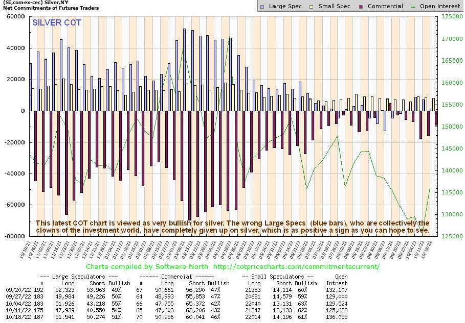
If silver is close to an optimum point to buy then we would expect to see the dumb Large Specs having no interest in it all, and that is exactly what we see on silver’s latest COT chart which shows the Large Specs net long positions to be virtually non-existant…
 Conclusion – this is looking like a great place to load up on the better gold and silver stocks.
Finally, what about the ongoing risk of an all-out market crash? – would that not drag gold and silver and PM stocks down even further? Well, it would, and as we saw on Saturday, the 2008 crash chart so far looks like a template for what we seeing unfold now. However, there is nothing to say that it must continue to conform with it. This time round is very different in that the powers that be fully intend to destroy the world economy, kill off most of the population and turn the survivors into cyborg-like slaves and have made their intentions very clear to anyone with more than a few functioning brain cells. This would best be achieved by a state of hyperinflation, Venezuela style, that would render the population destitute and totally at the mercy of the State (except for some preppers). Following this logic they will continue to create money to defer the debt market collapse for as long as possible and the hyperinflation that will result, which we are already close to, must mean an exponential rise in the price of hard assets like gold and silver.
End of update.
Posted at 7.45 am EDT on 24th October 22.