In this update we are going to look at a range of factors calling for an imminent market crash, focusing on and highlighting the biggest reasons for it, because with the plethora of market data that we are bombarded with on a daily basis it is often hard “to see the wood for the trees”, so we are going to stand back and look at the big picture and examine some of the most important indicators.
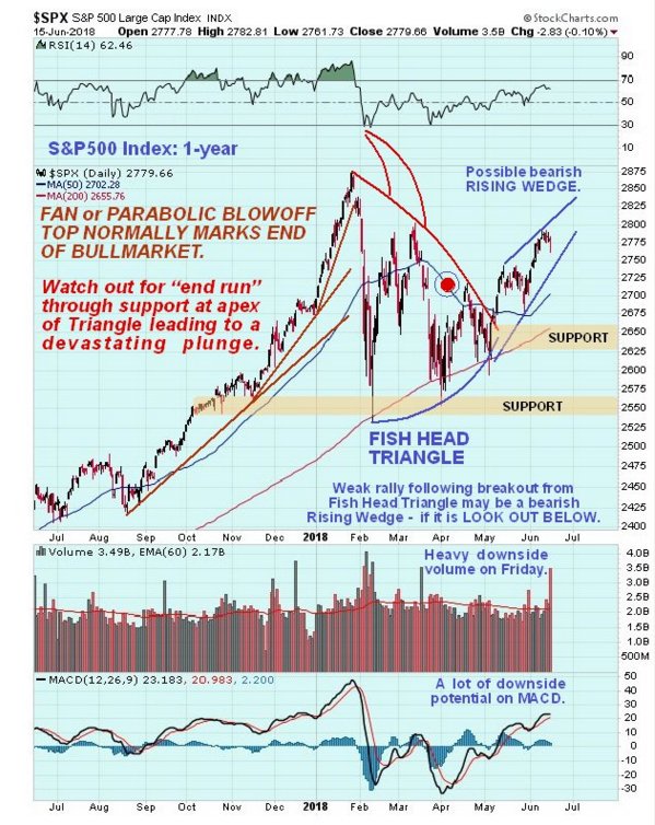
First off it’s worth looking again at the 1-year chart for the S&P500 index to remind ourselves why the top is probably in, and why the market should soon break down into a severe decline. A key point is that the late January peak was the culmination of a parabolic ramp which almost always marks the end of a bullmarket, as we saw more dramatically with Bitcoin back in December. This being the case, the Fish Head Triangle (so called because its boundaries curve inwards) that has formed above the 200-day moving average following the peak is a topping Triangle, and the breakout into a weak uptrend that followed is a bearmarket rally. What makes this rally such a deceptive trap is that the index is still above bullishly aligned moving averages, so many buy the dip players think that it’s “business as usual”, but according to our interpretation, the final peak of the long bullmarket occurred late in January, and the current situation is “the calm before the storm”, with the majority being clueless that the bullmarket is dead, but they’ll really start to grasp the concept once the index breaks down through the support at the apex of the Triangle and in so doing breaks down through its moving averages which will quickly turn down. The breach of these important support levels will be what triggers the crash phase. The reason that the market has been bumbling around for months marking out a top pattern is that a bullmarket of the magnitude that we have just seen does not usually turn on a dime straight into a bearmarket, just as you don’t stop a heavy freight train in an instant and get it moving at the same velocity in the opposite direction. It normally takes time and distribution to reverse a bullmarket into a bearmarket.
The reasons for the bearmarket now starting are powerful and fortunately very easy to explain. Two of the big reasons that the market rose so strongly in recent years were a combination of QE (Quantitative Easing), or money creation coupled with interest rates at extremely low levels. This enabled speculators, especially the fabled 1%, to have a field day borrowing money for nothing and leveraging it massively to drive asset markets higher, especially the Real Estate market and stockmarkets. Now the Fed has thrown the levers into reverse and is raising interest rates and draining liquidity, as it attempts to disgorge the vast quantities of Treasuries it bought up during the QE phase. This is QT (Quantitative Tightening) and you don’t have to be a genius to work out that since this policy is the exact reverse of that in existence just a few years ago, it will have the opposite effect on asset markets, and drive them down as speculators deleverage, and hear we should note that other Central Banks, like those in Europe, are set to follow the Fed’s lead and reverse out of QE.
The third and perhaps biggest reason that the market will crash is that the Fed’s reversal of policy will kill stock buybacks. Stock buybacks used to be illegal in the old days, but the rampant buyback culture of recent years which has been stoked by extremely low interest rates has made it a no lose game for CEO’s keen to goose their stock prices higher in order to get big fat bonuses for themselves. This prolific buyback activity has driven stock prices far higher than underlying fundamentals justify, and the scariest thing is that many of these CEO’s were not buying back out of revenue, but borrowing heavily at prevailing low rates to do so. What this means is that as rates crank higher, it is only a matter of time, and not much at that by the look of it, before the SHTF. The predicament of these suddenly distressed companies will quickly cause their deleveraging to snowball into an avalanche, sending the market lower at a rate that will make the blood curdling content of sites like kingworldnews.com look sedate and understated. The average Joe who has entered the market in the recent past has little idea of course of the extent to which the market has been pumped up higher and higher by the seemingly interminable buyback activity, and thus how far it can fall, once the fuel for this vanishes, as is happening right now.
Now we will proceed to look at a range of indicators that together tell the same story – of a market close to a crash. Most of these charts speak for themselves and require little commentary. Note that clicking on these charts will popup a larger, clearer version.
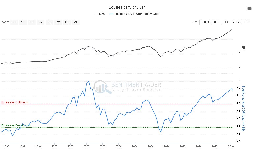
We start with the Equities as a percentage of GDP (Gross Domestic Product) which ratio is at similar levels to those which preceded the dot.com bust in 2000 and the 2008 market crash. No further explanation required…
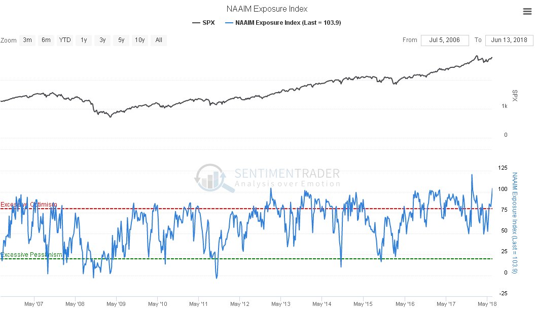
Next we look at the NAAIM (National Association of Active Investment Managers) chart, which shows that they are “all in”, with the reading on this chart at an extreme level that has seldom been topped in the past…
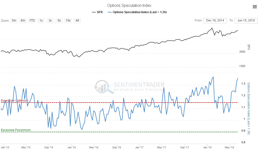
Moving on we see that the Options Speculation Index is close to record levels. While not by itself always a reliable indicator, look what happened last time it reached these levels…
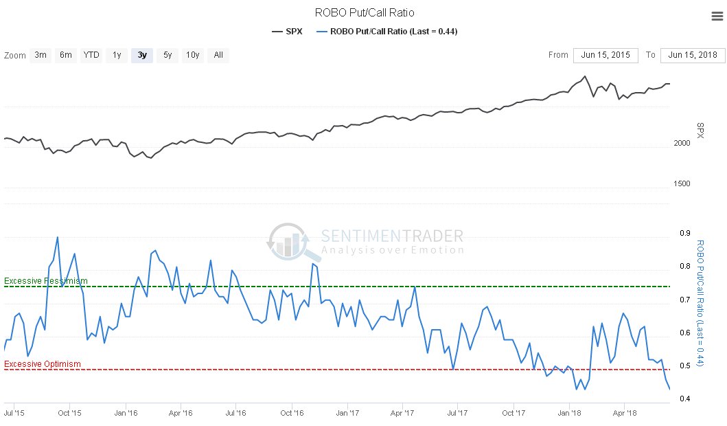
Meanwhile the Put / Call ratio shows that the normally wrong majority of options traders are falling over themselves bullish, with the reading only bettered (or worsened, depending on how you look at it) by the extreme it attained at the late January peak, right before the market plunged…
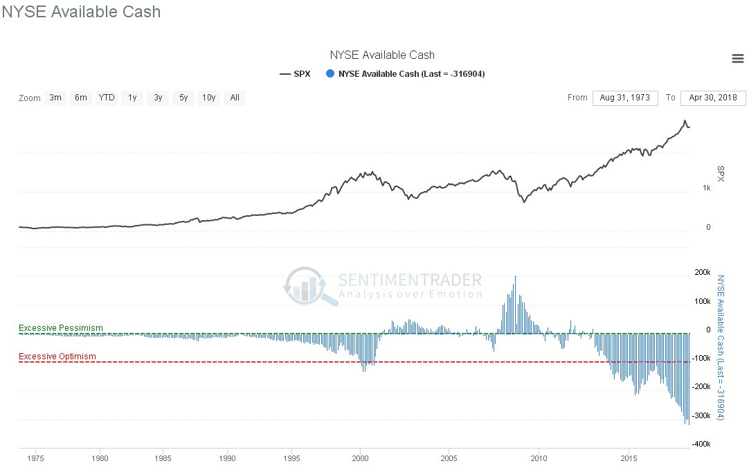
Last but definitely not least we look at the NYSE Available Cash chart, which ought to be enough to make the hairs on the back of your neck stand up, if they haven’t already. This is the same as a margin debt ratio chart, and shows that punters are leveraged to the hilt, and in fact way beyond it, thanks to the frenzied frothing buyback culture of recent years, and with the Fed hell bent on spoiling the party, THE STAGE IS SET FOR AN ABSOLUTE BLOODBATH.
This is why we don’t want to stick around, and will use the remaining limited time left to position ourselves to profit on the short side before the crash hits. It is thought likely that it will start within a month or two, three months at most, and it could start within the next few weeks.
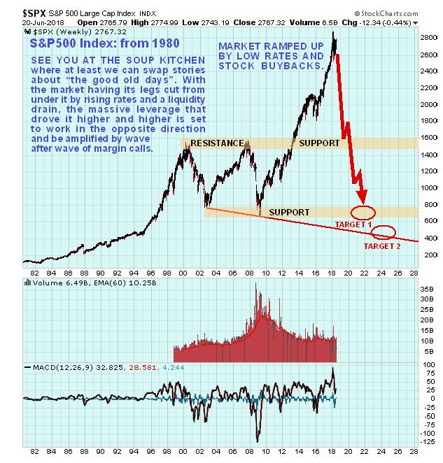
Where could the market end up once the crash has run its course? The following long-term chart for the S&P500 index chart is intended to give you an idea…
A happy Summer / Winter Solstice to you all.
Posted at 8.40 am EDT on 21st June 2018.