With a collapse in the dollar and hyperinflation now inevitable, it is clear that the dollar price of gold will eventually skyrocket, and when I say “eventually” I am not talking about in 5 or 10 years time. It is already starting to accelerate away to the upside and that means that the current dip has presented another buying opportunity, not just in gold itself but in silver and Precious Metals stocks too.
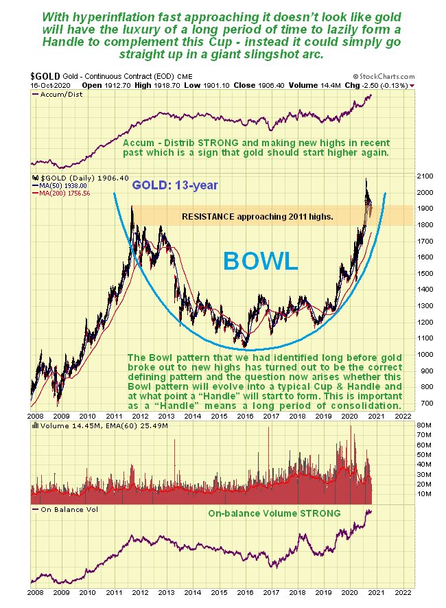
On gold’s latest 13-year chart we can see that the giant Bowl pattern has already driven a breakout to new highs in recent months and in this context the minor reaction of recent weeks is a perfectly normal development that unwinds the overbought condition somewhat and rebalances sentiment. The Bowl pattern can also be described as a Cup, and very often a “Handle” forms to complement the Cup before further significant gains are made, which is a period of consolidation that proportion suggests could last a year or two. Should such a Handle now form it would clearly be a source of major annoyance and frustration to investors in the sector as it would mean their holdings would generally go nowhere for a year or two. However, things are deteriorating at such a rapid rate that it is considered most unlikely that gold would get bogged down in this manner. The ongoing exponential rise in money creation to support a collapsing economy that has been made worse by the virus hysteria and disproportionate reaction of governments around the world means that the purchasing power of fiat most everywhere will decline at an accelerating rate, and since gold is “real money” that holds its value no matter what, it must therefore gain in price to compensate. What could therefore happen instead is that, rather than meander around for ages making a Handle, the steeply rising Bowl boundary generates a dramatic slingshot move higher in gold, which the current setup certainly makes possible, especially as it has just broken out to new highs. Before leaving the 13-year chart note the strong volume driving the advance up the right side of the Bowl and the strong volume indicators all of which indicates that a major bullmarket phase has begun, and with the 2011 highs having fallen, there is nothing to stop it. It is also interesting to observe how the freak March plunge, when everything was tanking, was contained and reversed by the Bowl boundary.

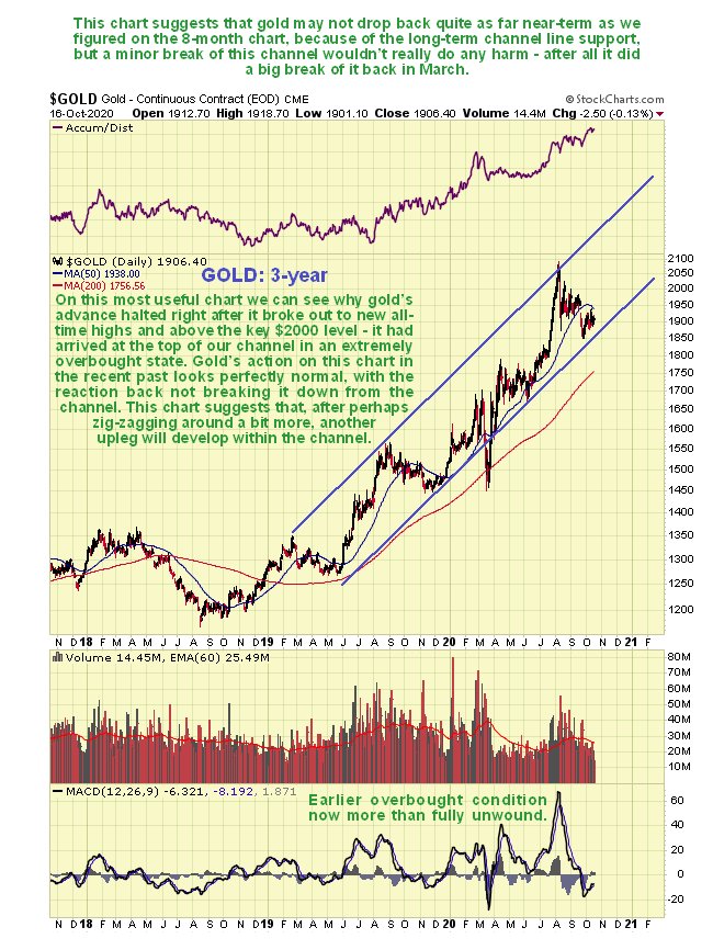
On the 3-year chart we can see that, apart from the freak drop in March when everything tanked, gold has advanced within the confines of the parallel channel shown. This channel shows us why gold’s advance stopped when it did early in August as it had arrived at the upper channel boundary, and it also makes clear that it is now back in buying territory, although it could dip back again to the $1850 area short-term before another major upleg starts, as we will see on its 8-month chart shortly. Only in the event of the stockmarket dropping hard again, as in March would be likely to see a more serious breach of the lower channel boundary, and that would likely be swiftly reversed as the Fed would quickly come riding to the rescue with trillions of newly created dollars.

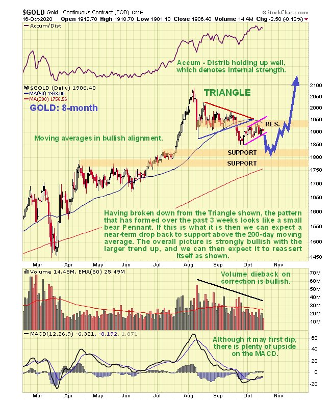
On gold’s latest 8-month chart we can see that, although it looks pretty well corrected from its early August highs, there is room for a little more reaction back to either of the nearby support levels shown and towards its rising 200-day moving average before the corrective phase is done, which the recent weak minor uptrend channel that formed following the breakdown from the Triangle suggests is quite likely, as it looks like a small bear Flag. If gold does react back as shown on the chart it will be viewed as presenting a “back up the truck” buying opportunity. The bullishly aligned moving averages and strong Accumulation line certainly bode well for the medium and long-term.

We are not bothering to look at the COT chart in this update since it is in middling ground, and gives no clear indication one way or the other.
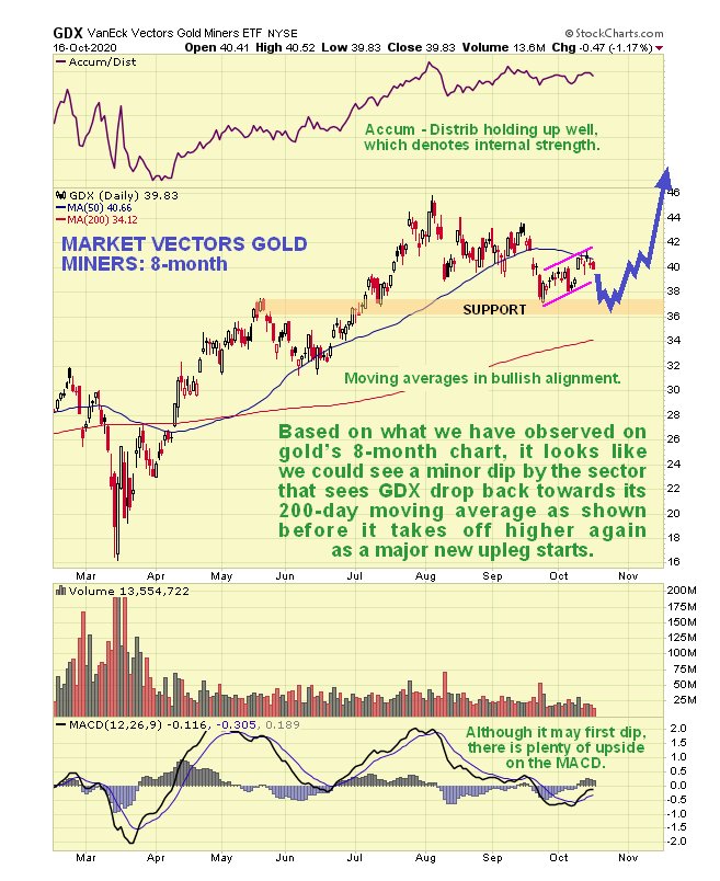
The 8-month chart for GDX shows us that, after a dramatic recovery from its mid-March panic lows to its mid-May peak, stocks have made little net progress since. We can also see on this chart that GDX (and thus PM stocks generally) looks pretty well corrected from its early August peak, although as with gold itself, the pattern that has formed over the past several weeks looks like a small bear Flag that may lead to renewed but modest decline probably back into the support above $36 and possibly a little lower towards the 200-day moving average. The earlier overbought condition is already fully unwound and again, moving average alignment is bullish and the Accumulation line is strong relative to price, all of which bodes well for the medium and longer-term. Any short-term dip will therefore be viewed as presenting a major buying opportunity. A possible and perhaps probable scenario is shown.

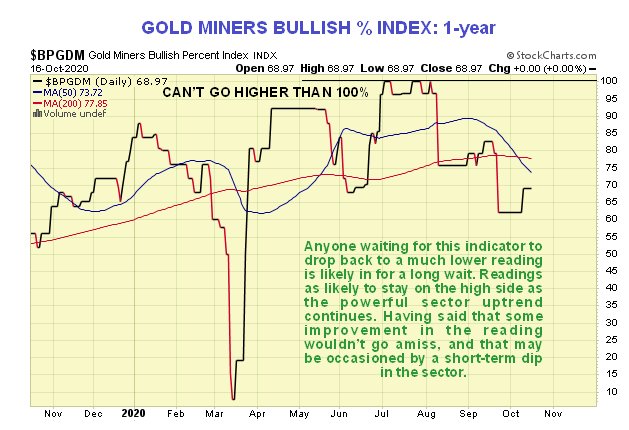
The Gold Miners Bullish % Index has certainly corrected back enough to permit renewed advance, although its reading is still a little on the high side, so another dip in this wouldn’t go amiss, such as may be occasioned by the minor drop that the 8-month chart suggests is likely soon.

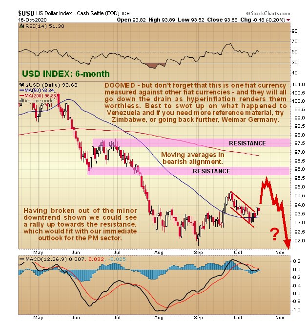
Finally the dollar index chart concurs with what we are seeing on the gold charts, for as we can see the larger trend is down with moving averages in bearish alignment. However, the mid-September breakout from the trading range has been followed by a small tight downtrend channel that could be a bull Flag – if it is, the dollar could soon make a run towards the resistance shown before rolling over and heading south again, which would be the occasion for the PM sector to react back a little more short-term as our charts suggest is likely.

Finally, it should be kept in mind that while the near-term scenario set out here is considered likely, it is not “set in stone” because there are so many variables in play over the next several weeks, so it is important to remain flexible and adaptable.
End of update.
