Gold is looking better than it has for a long time. As we will proceed to see the correction from its August 2020 highs looks to be complete with it shaping up for what should prove to be a massive 2nd impulse wave – and why shouldn’t it with inflation ramping up dramatically in the direction of hyperinflation?
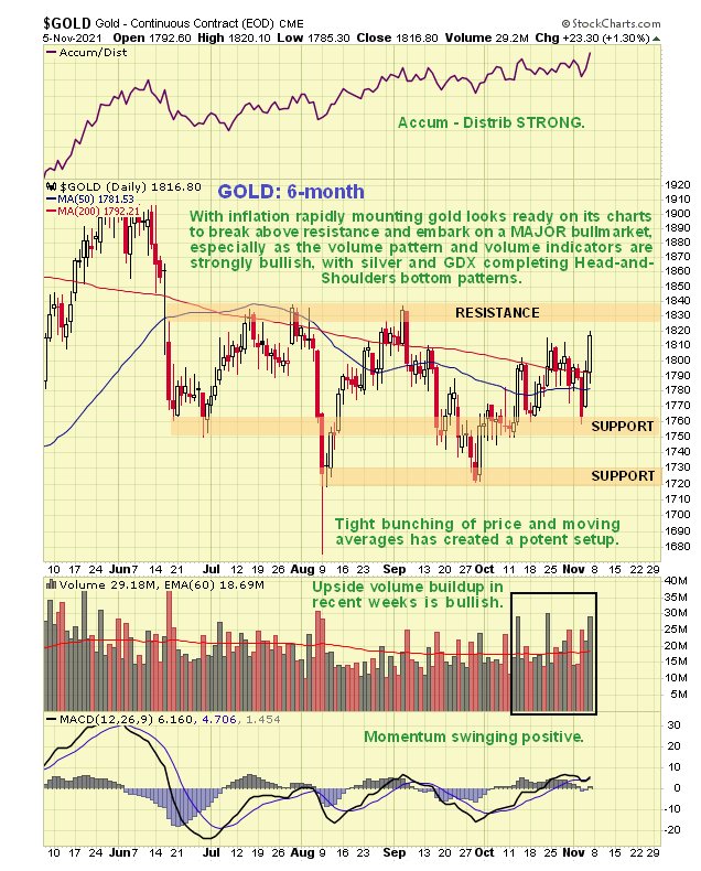
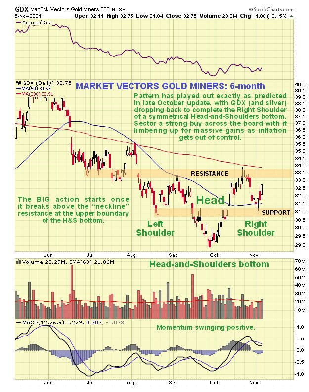
On the latest 6-month chart we can see how the corrective phase has gradually stalled out and come to a halt with the current tight bunching of price and moving averages creating a potent setup, especially as upside volume has been building noticeably in recent weeks so that it has driven volume indicators to new highs – this latter development is very bullish indeed.
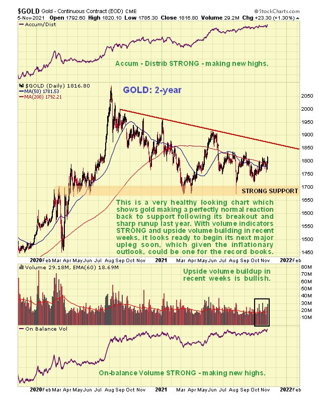
On the 2-year chart we see how the correction from the August 2020 high has served to correct the sharp runup from March through August 2020 and has rebalanced sentiment. On this chart we also see how this correction stopped at a zone of quite strong support and the strong positive divergence of both volume indicators which is a powerful sign that a major new upleg is fast approaching.
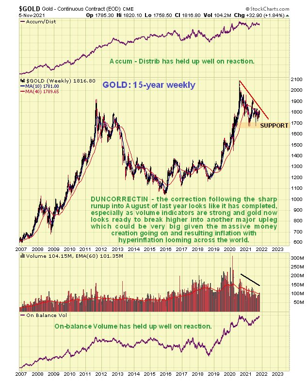
The long-term 15-year weekly chart puts everything into perspective. On it we see how the mid-2019 breakout from the giant base pattern triggered a sharp runup to new highs. This called for the correction that we have witnessed since August 2020 that is now believed to have run its course. Given how inflation is already ramping up in the direction of hyperinflation it is somewhat surprising that gold hasn’t taken off sooner, but it is viewed as inevitable that it will given the environment we are moving indicator, and the strong volume indicators certainly suggest that this is to be expected.
Now, and with Larry’s kind permission, I present a recent version of his detailed gold chart. Larry states: “We are walking up the wall of the Rounding Bottom Echo line. So far it has been performing perfectly”. Another way of putting this of course is that since its August 2020 peak gold has been moving sideways to down making a Handle to complete a giant Cup & Handle base, with this Handle consolidation serving to recharge gold in readiness for another big move up…
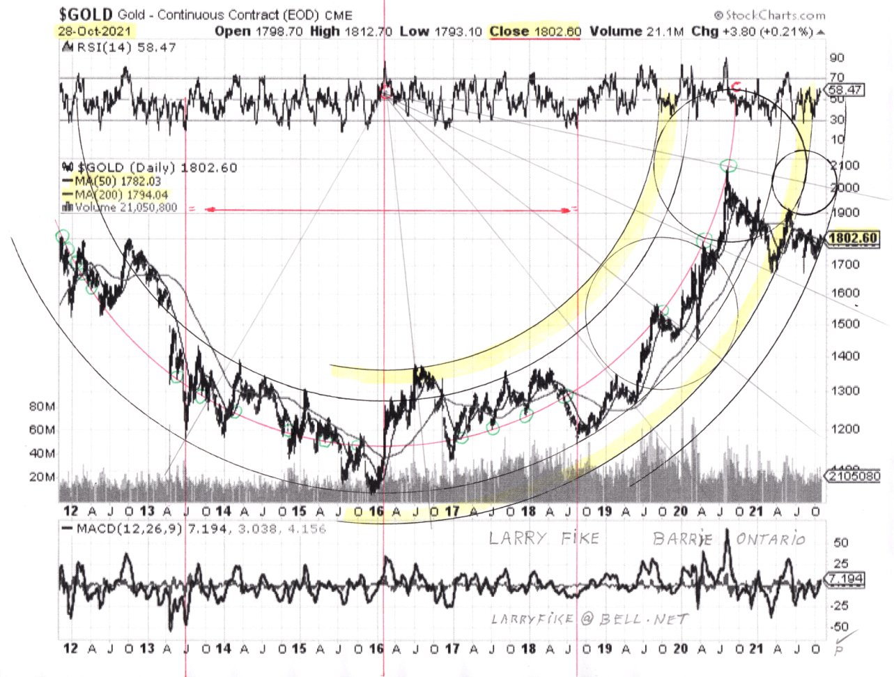
Click on chart to enlarge. Chart courtesy of Larry Fike.
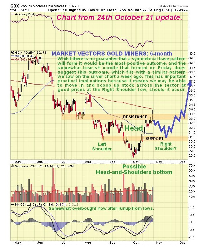
If gold looks so positive here as it does, then what about PM stocks? On the 6-month chart for GDX we can see that it is approaching completion of a fine fairly symmetrical Head-and-Shoulders Bottom. We had earlier identified this pattern on the site towards the end of October, calling for a drop to mark out the Right Shoulder of the pattern which is what we have since seen. The way the PM sector charts look now anyone wanting to take positions in the sector should get on with it without delay, because once GDX breaks out of the top of this pattern it could get moving with alacrity, quickly leading to much higher prices across the board.
GDX 6-month chart from 24th October update…
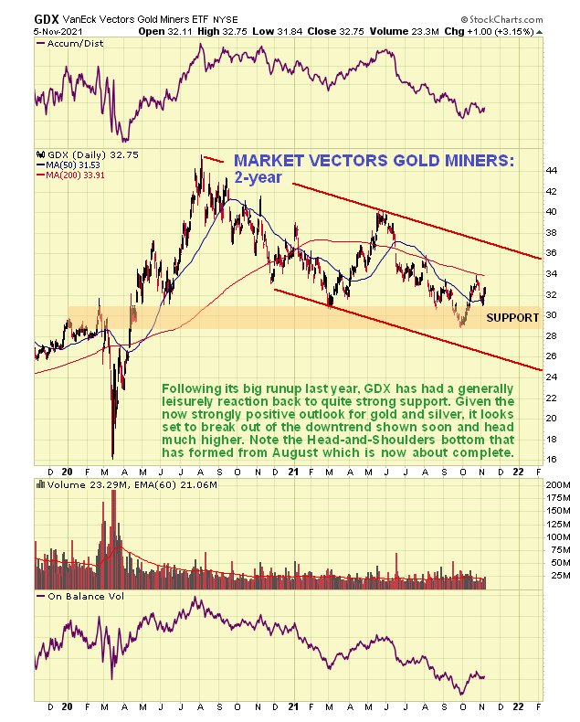
On its 2-year chart we can see that, like gold, GDX has reacted back from its August 2020 peak to a zone of significant support where it is now basing and looking set to reverse to the upside. The big upside action can be expected to follow first the upside breakout from the H&S bottom and especially when this is followed by a break out of the downtrend channel shown on this chart.
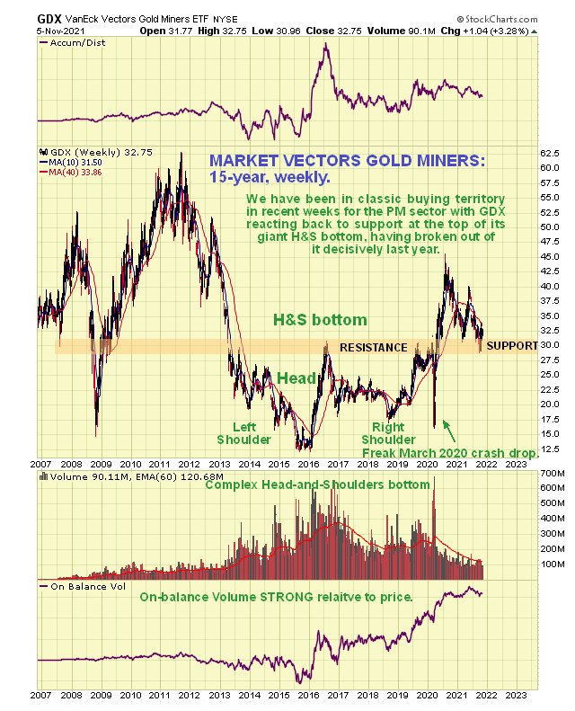
The 15-year chart for GDX makes it clear why the correction targeted this area – it has arrived back in a zone of quite strong support at the upper boundary of the giant rather complex Head-and-Shoulders bottom that it earlier broke out of in April of 2020. Thus we are clearly at a good point to buy the sector, with the current relatively light volume a sign that speculative froth has been flushed out.
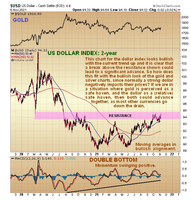
It is worth ending with a quick look at the 2-year chart for the dollar index, where an apparent anomaly needs to be addressed. While it could yet roll over and drop, this dollar index chart does look bullish – if it should overcome the resistance level shown we could see a significant advance. Normally of course this would be expected to trigger another retreat by the Precious Metals sector. However, it is now thought that we are in a situation where gold is a safe haven and the dollar is a relative safe haven so they could both go up together. The reason for this is that while all currencies are being destroyed and diluted at a record rate, the dollar, because of its mass, is being destroyed less fast than other currencies, hence the rise in the dollar index. In this situation it is clear that the dollar and gold could rise in tandem. This would explain why the PM sector charts look so positive when the dollar index looks like it could break higher and advance as well. From this we should conclude that PM sector investors should no longer fear a rise in the dollar index.
End of update.