When you are following the markets closely day after day it can be easy to lose sight of the big picture. So with the “everything bubble” getting closer to bursting, leading to universal mess and mayhem, there could not be a better time to look at the long-term picture for gold and silver, in order to see whether they are going to salute and go down with the ship, like they did in 2008, or constitute a lifeboat and a profitable means of escape for more fortunate investors.
I am therefore pleased to be able to report that it will almost certainly be the latter, for reasons that we will now elucidate on the respective long-term charts for gold then silver.
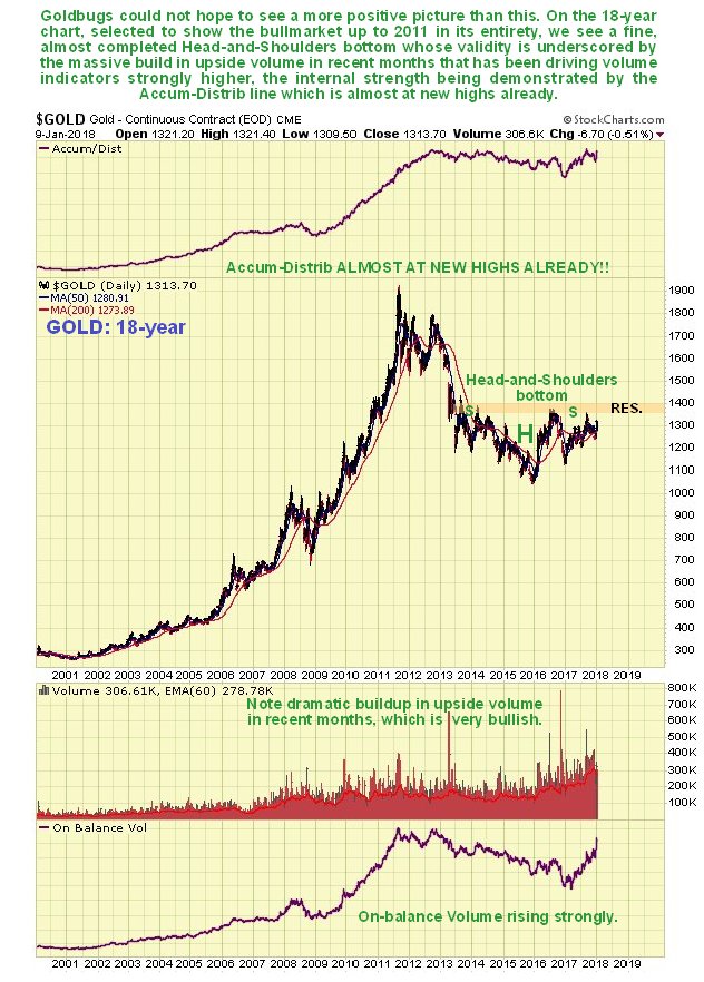
On gold’s latest 18-year chart – a time period selected to show the prior 2000’s bullmarket in its entirety, we can readily see that a potential Head-and-Shoulders bottom has been forming since 2013, and the probability that this is the genuine article, the “real deal” is vastly improved by the dramatic increase in upside volume over the past 2 years as this base pattern has approached completion, which has driven volume indicators strongly higher over the past year, such that, rather incredibly,
the Accum-Distrib line is already close to making new highs, which is a very bullish indication indeed.

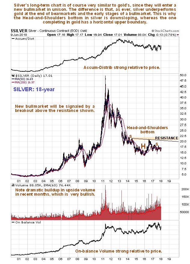
It’s pretty much the same story for silver, with two key differences – silver’s Head-and-Shoulders bottom is downsloping and the volume indicators are not quite as strong. However, these manifestations are not negative, for it is normal for silver to underperform gold towards the end of a sector bearmarket and during the early stages of a bullmarket.

Are there any Precious Metals stocks showing similar bottoming patterns? There certainly are – loads of them, and we will have a look at two examples here, one for a larger gold stock and one for a larger silver stock, to illustrate the point, so that you will understand that this is not just an academic exercise – and that you are currently being showered in opportunities to make big money in this sector.
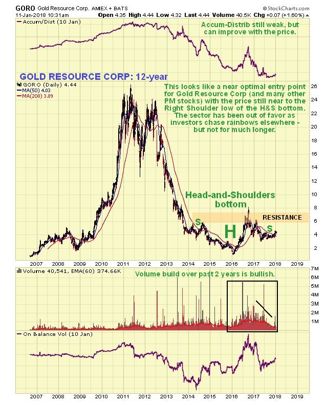
The long-term chart for Gold Resource Corp shows that it is completing a giant Head-and-Shoulders bottom that parallels the one in gold itself, and since the price is still quite close to the low of the Right Shoulder low of the pattern, it is at a good entry point.

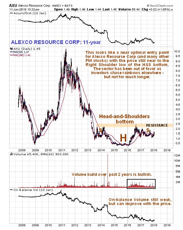
The long-term chart for Alexco Resource Corp shows that it is completing a fine giant Head-and-Shoulders bottom that parallels the one in silver itself, although it is not downsloping, and since the price is also still quite close to the low of the Right Shoulder low of the pattern, it too is at a good entry point.

Gold and silver have not done well in recent years, having been completely overshadowed by the broad stockmarket and more glamorous sectors like Biotech, Cannabis, Cryptocurrencies and the FANGS etc. If they go roaring up, then it means that something else is going to have to go down, and that probably means most everything else in a market crash, which is already being predicated by action in the bondmarket and other factors, and all the easy money momentum chasers who are now almost everywhere are going to wind up being slaughtered en masse like Pilot Whales on a Faroes beach. We are not going to let that happen to us.
Note that additions and improvements may be made to this article later.
End of update.
Posted at 1.50 pm EST on 11th January 18.
