The shorter-term chart for gold still doesn’t looks very inspiring, but in this game “the tail wags the dog” and the chart for GDX shows a magnificent example of a “Dragonfly Doji” reversal candle, which implies that pretty soon the chart for gold is going to look a whole lot better. The reason that the tail wags the dog is simple – hardcore quickfire traders will jump on a vehicle like this when they scent a turn, rather than gold itself, which slower moving traders and investors will follow up and buy.
We can see this reversal candle to advantage on the 3-month chart for GDX. A Dragonfly Doji is a long-tailed candle where the open and close are at the same point at the top of the day’s range, and it shows a day where the market sold off heavily, but then came roaring back in the late trade, and if a candle like this shows up after a lengthy decline as is the case here, it normally marks a reversal, and the huge 10-month record volume yesterday, that drove up the Accum-Distrib line, makes it even more convincing. What this means is that Precious Metals share investors can exit their storm shelters with confidence, and subscribers can buy across the broad with confidence, hopefully ahead of everyone else getting the same idea.
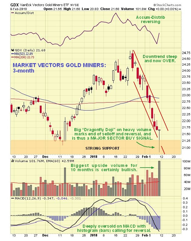
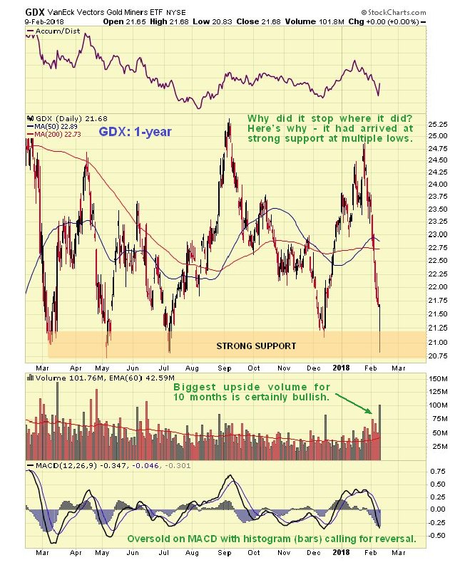
Why did GDX reverse where it did? That’s easy to see on the 1-year chart for GDX, where it is clear that it reversed at a strong support level at multiple lows.
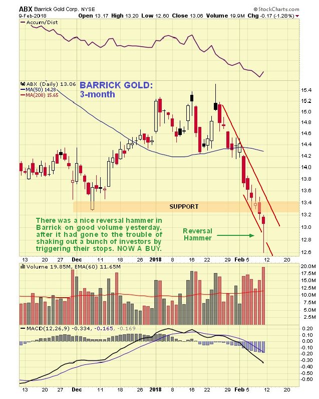
There were reversal candles in a range of stocks across the sector yesterday, with a fine example on the chart of Barrick Gold, which took the form of a bull hammer. It was interesting – and typical – to see the market go to the trouble of triggering the stops of various investors before reversing sharply to the upside.
End of update.
Posted at 5.50 am EST on 10th February 18.