In this update we are going to do something that we haven’t done for a while, which is to examine the charts for the Market Vectors Gold Miners ETF, code GDX, in an effort to figure out where it is in its cycle, and as we will see there is every reason to be positive about its future outlook.
Generally speaking, the Precious Metals sector has been dull for a long time, since early August 2020 to be exact and it has seriously underperformed the market as a whole, which is a positive in the sense that this makes it more undervalued with more upside.
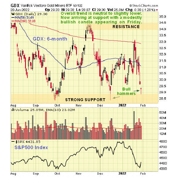
In recent months, as we can see on the latest 6-month chart, GDX has been pretty much rangebound above a strong support level, with its overall trend being neutral to slightly lower. Over the past couple of weeks it has dropped quite sharply, which of course was partly in sympathy with the sharp drop in the broad market, and it is looking more of a buy here with the appearance of a bull hammer on Friday close to the support. Apart from these observations, this chart is of little use technically, so we will now proceed to look at the 2-year chart, which gives us more of an idea what’s going on.
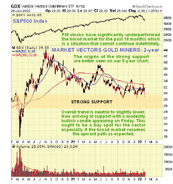
On the 2-year chart we can see that following the strong advance out of the March 2020 panic lows the sector peaked in August of that year and then went into a long gruelling corrective phase with the low of last September probably being the final low for the correction, so that in recent months it has been in a basing trading range. The S&P500 index has been added at the top of this chart so that you can see how the sector has underperformed the broad stockmarket since the August 2020 peak.
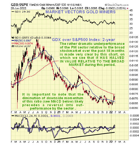
The extent to which the PM sector has underperformed the broad stockmarket is made dramatically clear by the next chart which shows GDX divided by the S&P500 index. As we can see it has been cut in half compared to the broad market, and that means opportunity.
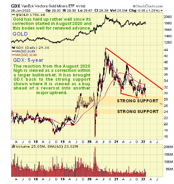
While the 2-year chart for GDX looks more encouraging than the 6-month chart, it is on the 5-year chart that we really get a sense of what’s going on and what time it is on the market clock for this sector. On this chart the entire downtrend from the August 2020 highs looks like a correction to the big rally from the 2020 lows, especially as it has taken the form of a bullish Falling Wedge that has brought the price back down into a zone of particularly strong support where it is now believed to be basing.
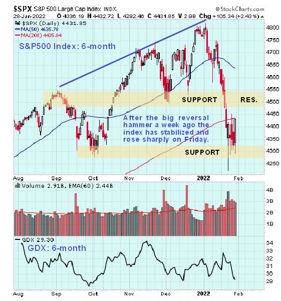
For the PM sector to take off higher again from here, we will need to see the broad stockmarket play its part by “not putting a spanner in the works” and crashing, so how does that look? The sharp drop in the broad stockmarket in the middle of this month still looks like a correction, even though, as we can see on the latest 6-month chart for the S&P500 index, it did take it some way below its rising 200-day moving average, causing some technical damage. However, it did stop at the support level at its early October lows, where a prominent bull hammer appeared as we noted at the time, and after bouncing around it had another good day on Friday. So at this point it looks set to recover and the key factor is the debt market which doesn’t look set to blow up yet with the Fed intent on creating still more debt with which to buy up the world.
The conclusión to all this is that the broad stockmarket doesn’t look like it wants to crash yet, and the PM sector meanwhile looks like it is at a great “buy spot” being down on strong support that looks set to generate a breakout before much longer from its bullish Falling Wedge. As ever it is best to be selective about buying gold and silver stocks, going for the ones that look stronger and set to go up for reasons of their own, like the one we looked at yesterday. It is because of the hitherto frail condition of the sector that we haven’t looked at larger gold and silver stocks in the recent past, but that will change as it becomes more evident that a major sector uptrend is building.
End of update.
Posted at 9.45 am EST on 31st January 22.