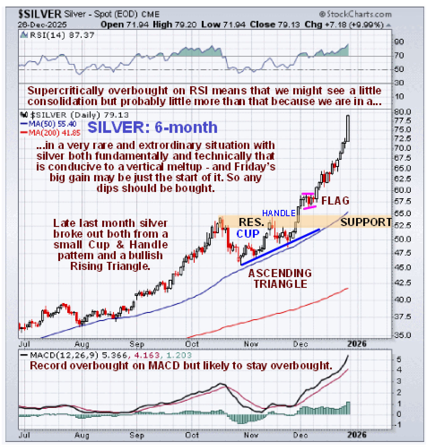
With copper at last joining the party as recently as last Friday we are now in a full-on pan-metals bull market – in other words major metals are advancing in unison. The reason for this is not hard to see with the Fed and other Central Banks preparing to do another round of full-on QE in order to stave off the intensifying debt crisis that is likely to be an order of magnitude larger than anything that has come before. This will enable them to continue to drive money up to the super-wealthy at the top of the pyramid with the hyperinflation that will result being merely a problem for the inconsequential “little people”. It is recognition of this reality that is driving money to seek safe haven in assets with intrinsic value such as metals and especially Precious Metals at an ever increasing rate. Silver will be and already is the star performer amongst all metals because of its rare and unique situation where fast rising demand is meeting an acute dearth of supply. This is due to an unprecedented confluence of fundamental and technical factors. Since silver is the Big Story we will start by looking at silver’s chart to put its meltup gain of approximately 10% on Friday into context.
There are two crucial points to make regarding the action in silver shown on its 6-month chart below. The first is that, following its large gains from late last month culminating in the big white candle on Friday, it is now massively overbought, being record overbought on its MACD indicator shown at the bottom of the chart – but does this mean that we will see a lengthy period of consolidation or even a reaction? Probably not, because this is a meltup resulting from a rare combination of extraordinary factors as mentioned above, so, if anything, this steep avance is likely to continue and it may even accelerate further. If there is a minor reaction it should soon be followed by renewed advance and would therefore be viewed as an opportunity to add to positions.
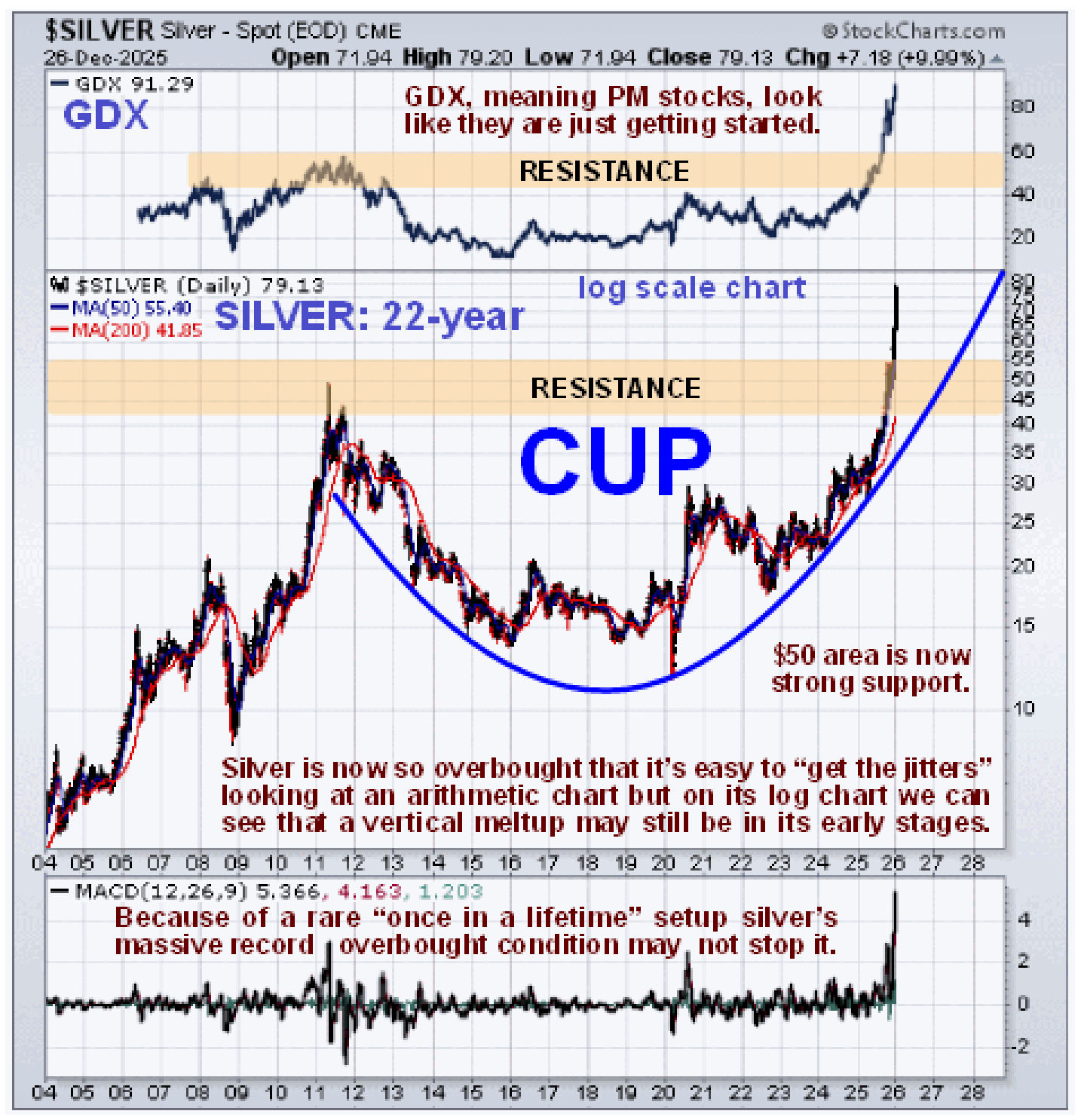
On silver’s 22-year chart we can see that, following the 2011 peak, the trend was very gradually steered from down to up by the giant parabolic Cup pattern shown, and it is only once it broke out above the resistance at the top of this pattern, which happened as recently as the end of last month, that the price was free to accelerate to the upside, and then, once it cleared the last resistance, which we had earlier defined as being at $55, it truly entered meltup mode. Although it looks overbought on shorter-term or arithmetic charts, and it is overbought, this chart makes clear that silver still has huge upside potential from here as it looks like the larger move is still in its early stages.
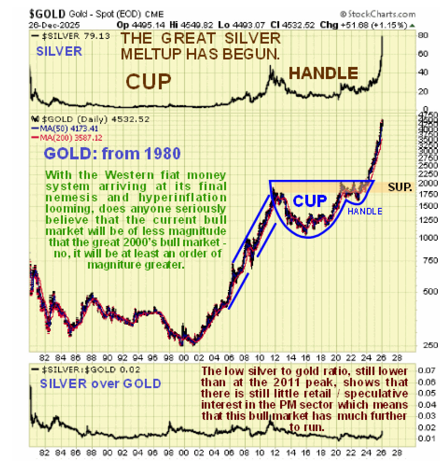
What about gold? – due to time constraints we are only going to look at the very long-term chart going back to 1980 in this update. The reasons for focusing on this chart are twofold. First, it will enable you to compare it directly to the long-term CHART OF THE AGES presented towards the bottom of the page, which is for the same time period. Secondly, it allows us to compare the current gold bull market to the great 2000’s bull market. As we can see, the current bull market that began early last year with a breakout from a gigantic Cup & Handle consolidation pattern that built out from the 2011 highs still has a ways to go to equal the great 2000’s bull market, but given that we are now entering into a period of collapsing currencies in the face of manic money creation, it is clear that this bull market is likely to end up dwarfing the 2000’s bull market. This therefore means that gold’s advance has much further to go and its broad uptrend should continue.
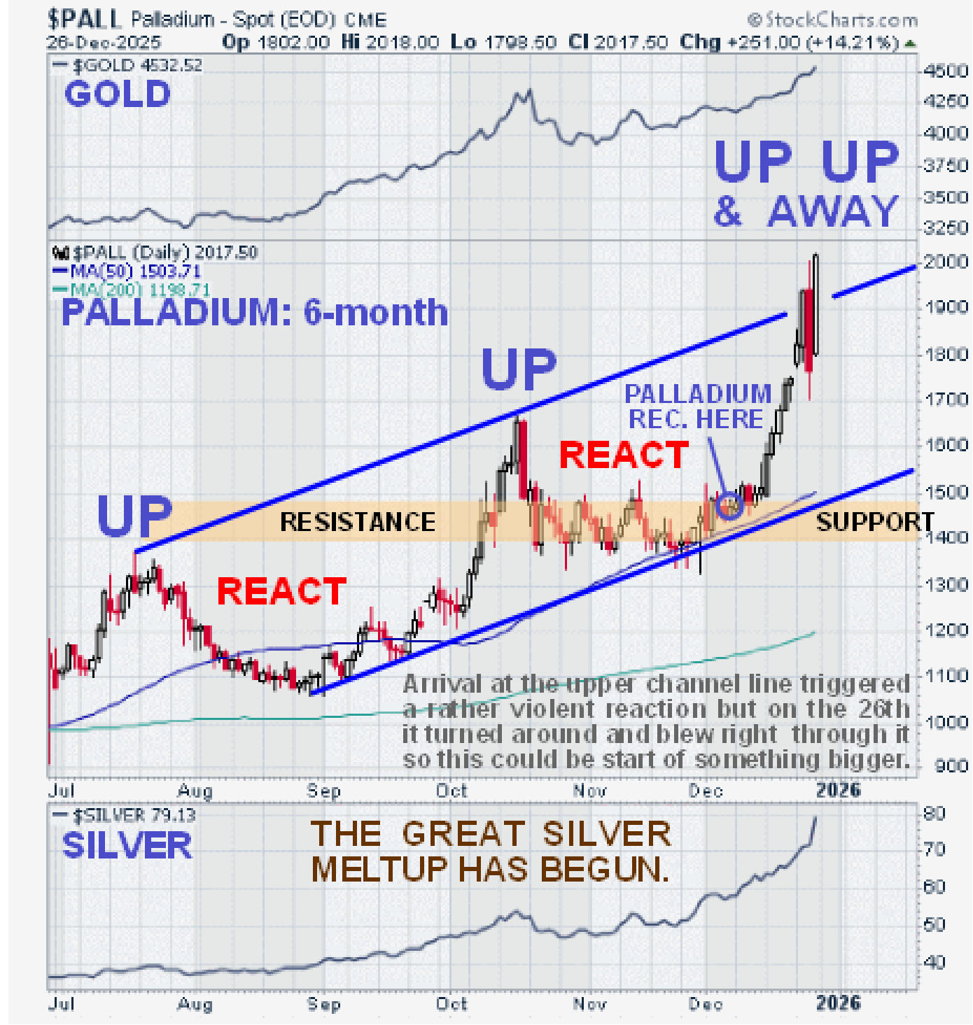
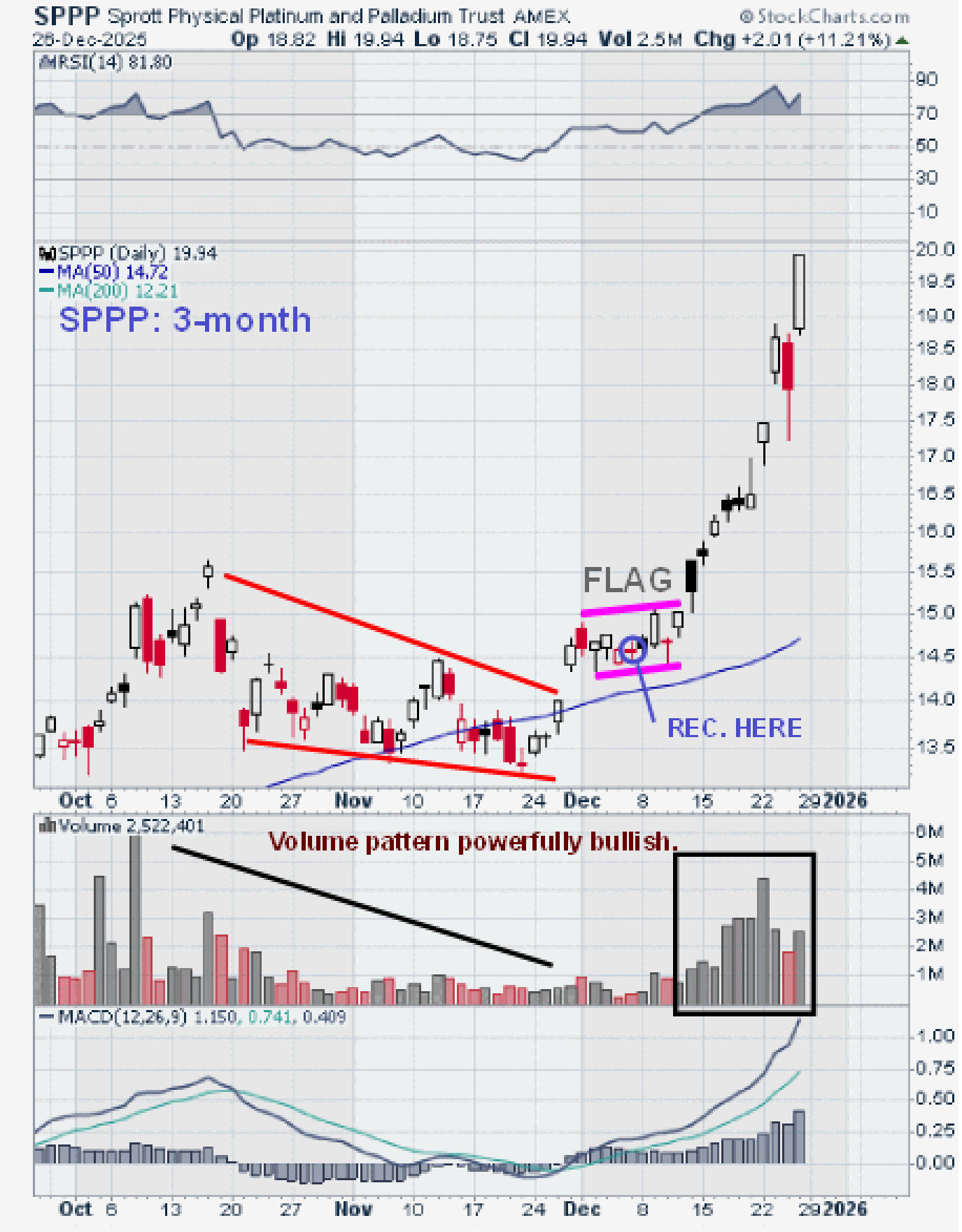
You may recall that we took time out early in December to light on Platinum and Palladium, having correctly figured out that the continuing strong gains in gold and silver would spill over into other metals and for pretty much the same reasons. This wasn’t “rocket science”, it was plain common sense and the articles on both these metals entitled
PLATINUM STARTING NEXT BIG UPLEG and
PALLADIUM READY FOR NEXT BIG UPLEG turned out to be very timely indeed for both metals broke out into strong rallies which in the case of platinum turned out to be rather spectacular as can be seen on their latest charts below…

Although the performance of Platinum Group Metals (PLG) in response has been disappointing so far, we “hit it out of the park”
buying the Sprott Physical Platinum and Palladium Trust on 7th December before it broke out of a small bull Flag to rocket higher, as can be seen on its latest 3-month chart below.
We also figured out that copper was due to join the party. It dragged its feet for weeks but on Friday it finally “got with the plot” and broke strongly higher out of a very bullish “Running Flag” which means that it is upwardly skewed, as we can see on its latest 3-month chart below. However, it should be kept in mind that it has yet to break above its July highs on the CME which occurred ahead of the tariff smackdown, but that said there is not much resistance in that price zone so it should have little trouble making it to new highs, especially as it is not all that overbought yet on its MACD indicator.
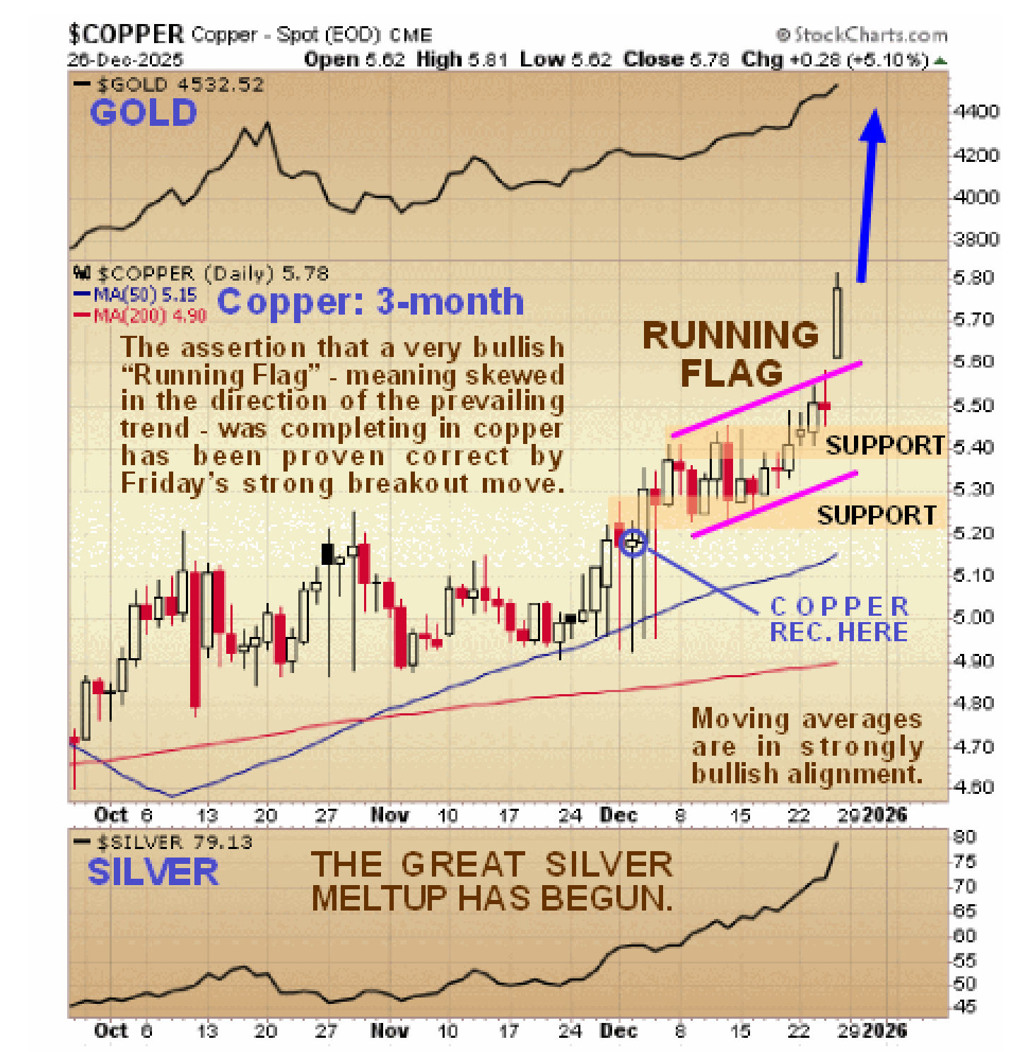
The copper plays that we went for on 4th December in
WAYS TO PLAY COPPER’S IMMINENT BIG UPLEG are all up with the United States Copper Fund breaking strongly higher on Friday.
For the benefit of the numerous citizens and even some investors who get routinely conned by government spokesmen (persons) and of course the politicians themselves into believing that “the economy is on a firm footing” because the stock market continues to make new highs, we choose instead to look at the stock market expressed in real money, that is to say compared to the gold price. US stock market indices are measured in dollars which are not real money – they are intrinsically worthless fiat that is losing purchasing power at an ever increasing rate. So, we don’t get fooled by this because because we look at the stock market measured against gold and what do we see on the 15-year chart for the S&P500 index measured against gold? We see a market that, measured in real money, that is to say gold, is verging on a breakdown from a giant top area. Once that happens, the stock market will be in a real bear market losing value at an increasing rate.
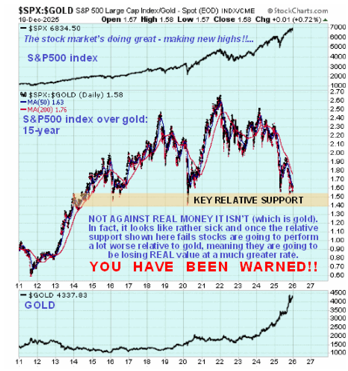
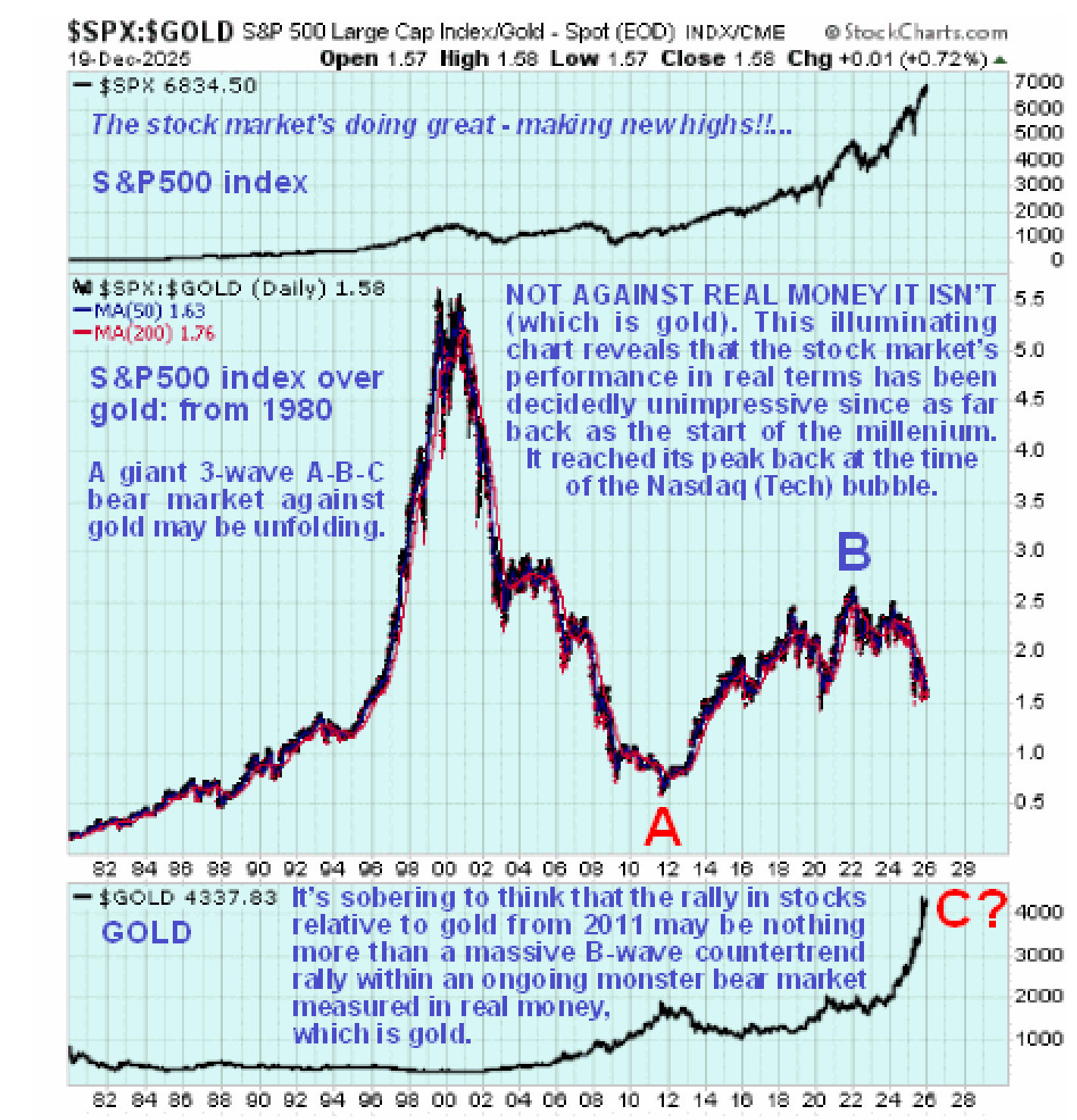
The stock market looks even worse on our long-term chart going back to 1980 measured against gold (real money). Here we see that its final high was attained 25 years ago at the peak of the dot.com boom (Tech. bubble)! This means that the big B-wave recovery from the 2011 lows (on this chart) may be nothing more than a countertrend relief rally within an ongoing massive bear market in real terms which as we saw on the 15-year chart above, looks set to reassert itself.
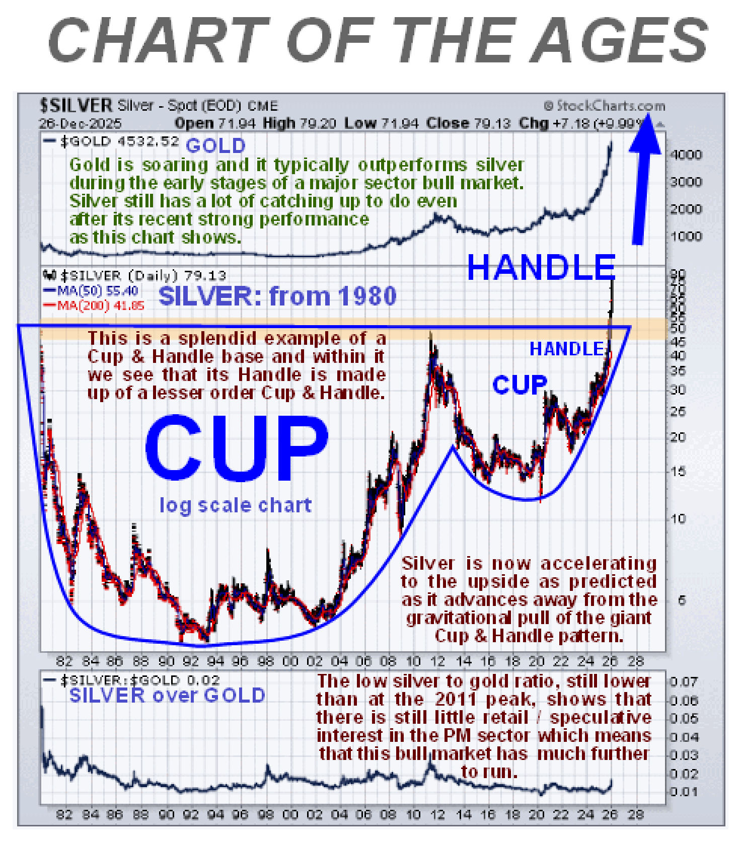
Even though the outlook for 2026 is decidedly grim with the prospect of unprecedented money creation leading to hyperinflation, the deranged and retarded maniacs running Europe continually trying to provoke Russia into nuking them, other wars possibly breaking out and AI leading to massive job losses, “it’s an ill wind that blows nobody a bit of good” - as they say “every cloud has a
SILVER lining” and our updated
CHART OF THE AGES which was
first wheeled out months ago shows that silver’s bull market has much, much further to run. Having taken 45 years to break out of a gigantic Cup & Handle pattern, it’s highly unlikely that silver’s bull market will be over in a year or two. The
minimum measuring requirement of this pattern calls for silver to advance by an equal distance on this log chart to the depth of the Cup, which means that the price will advance to several hundreds of dollars, at the least. This lays to rest any contention that its bull market will be over anytime soon.
 Conclusion: for a long time into the future, probably several years and maybe longer, the metals markets are going to be one of the best places to be and with gold and silver producers set to make money “hand over fist” with the prospect of big dividends from the larger ones, there are very big gains ahead for the Precious Metals sector, especially as the big rally in the sector still appears to be in its earlier stages as we glimped on the chart for GDX at the top of the 22-year chart for silver.
End of update. Note that this article may later appear on some public websites.
Posted at 11.15 am EST on 28th December 25.